

-poster-00001.jpg)


I conducted user interviews, which I then turned into empathy maps to better understand the target user and their needs. I discovered that many target users shopped using their PCs instead of using their mobile phones application. Also, many of the users wanted to be able to make healthy meals for their kids because they reported having a feeling of guilt when ordering-in because they felt that they were harming their children. The main motive for ordering-in was that they didn’t have time to cook or didn’t enjoy it. Another reason was to have fun and to try something new.
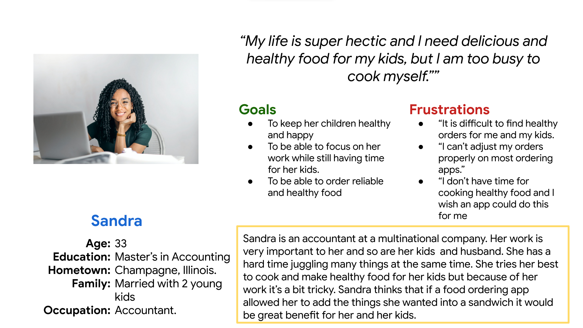
Sandra is a Married working mother with 2 young kids who wants to be able to order healthy food for her family because she would rather spend the limited time with them.
Mapping Sandra’’s user journey showed how important it would be to create an app that allows users to create custom sandwiches with healthy ingredients.


Difficulty with website navigation was a primary pain point for users, so I used that knowledge to create a sitemap. My goal here was to make strategic information architecture decisions that would improve overall website navigation. I choose mix of hierarchical and sequential navigation.
Moving from paper to digital wireframes made it easy to understand how the redesign could help address user pain points and improve the user experience. Prioritizing useful button locations and visual element placement on the home page was a key part of my strategy.
Next, I sketched out paper wireframes for each screen in my app, keeping the user pain points about navigation, browsing, and checkout flow in mind.The home screen paper wireframe variations to the right focus on optimizing the browsing experience for users.


To create a low-fidelity prototype, I connected all of the screens involved in the primary user flow of adding an item to the cart and checking out.
At this point, I had received feedback on my designs from members of my team about things like placement of buttons and page organization. I made sure to listen to their feedback, and I implemented several suggestions in places that addressed user pain points.

I conducted two rounds of usability studies. Findings from the first study helped guide the designs from wireframes to mockups. The second study used a high-fidelity prototype and revealed what aspects of the mockups needed refining.


Based on the insights from the usability study, I made changes to improve the navigation of the menu. This allowed them to move to different sections in the menu without having to scroll up and down.

Based on the feedback I gave the users the option to choose to go to the menu or the cart after finishing creating their sandwich in order to reduce frustration after creating the sandwich.


My hi-fi prototype followed the same user flow as the lo-fi prototype, and included the design changes made after the usability study, as well as several changes suggested by members of my team.


Target users reported that the application was easy to navigate through. Using pictures made it easier for people with visual impairment and who don’t understand English really well to use the website easily.
I learned that after seeing your website for a long time you can easily oversee flaws that is why conducting usability studies is crucial to make the design as close to perfect as possible.
