1.0 Overview
I joined a cloud contact center startup to design a dashboard that would help agents feel motivated while staying on top of their performance goals. The goal was to transform vague, often stressful metrics into something clear, actionable, and encouraging for agents during their daily workflow.
2.0 Problem

Clarity Lost in the Noise

I joined a cloud contact center startup to design a dashboard that would help agents feel motivated while staying on top of their performance goals. The goal was to transform vague, often stressful metrics into something clear, actionable, and encouraging for agents during their daily workflow.
3.0 Solution

Turning Metrics into Momentum

I designed a clear, motivating dashboard that transformed scattered data into actionable daily insights, empowering agents to understand and improve their performance with confidence.
4.0 Key Challenges

Clarity Amid Uncertainty

Challenge

•Sole Ownership: Managed research, design, testing, and iteration alone.
•Vague Brief: Tasked to motivate agents through performance feedback without clear direction.
•Undefined Metrics: Worked with unclear KPIs and legacy system limitations.
•Limited Input: Relied heavily on user feedback due to minimal stakeholder involvement.

Solution

•User Research: Conducted interviews with agents to identify real pain points and needs.
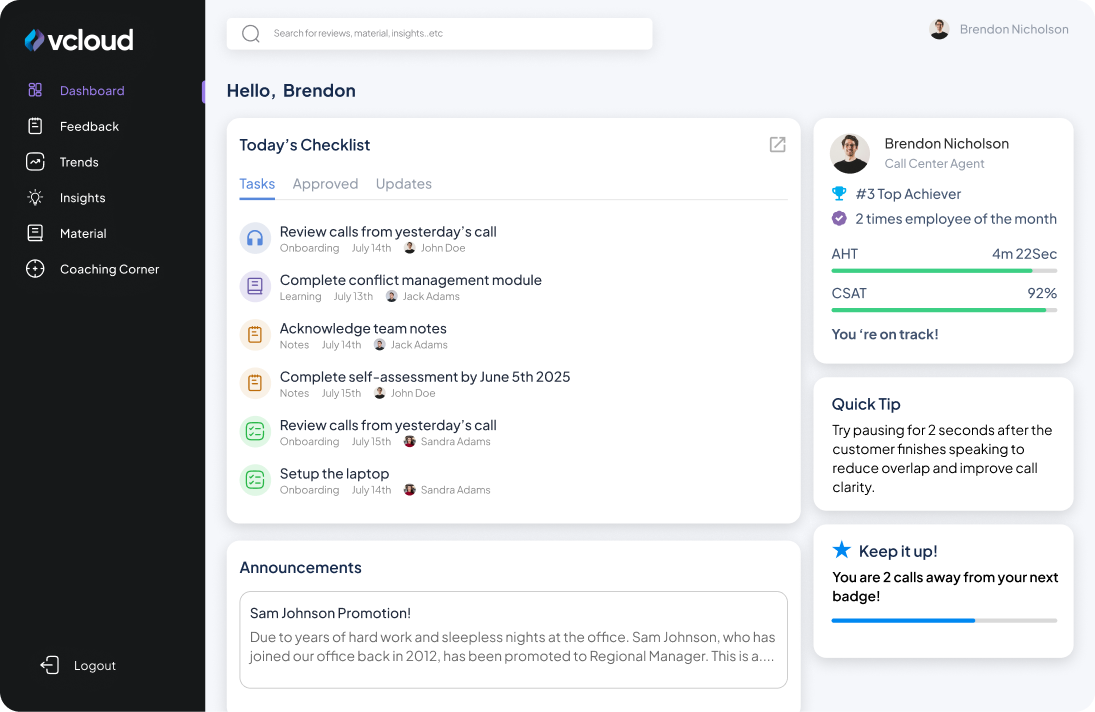
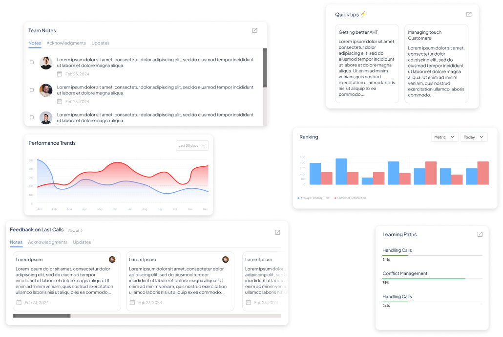
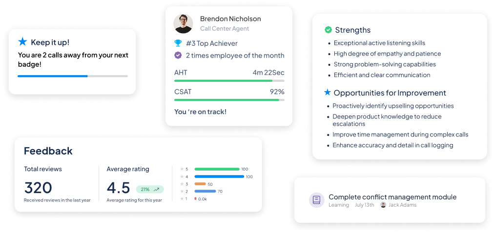
•Motivational Design: Focused on progress badges and checklists to encourage engagement.
•Rapid Prototyping: Used quick iterations and feedback loops to refine the dashboard continuously. 
•Balanced Approach: Combined clarity and motivation to build an actionable and approachable tool.

5.0 Strategy

Grounded in Real Agent Needs

To avoid building a dashboard that would simply become another ignored tool, I:

•Spoke with Agents: Ran quick interviews to learn what they found confusing about current performance reviews.
•Mapped Motivation Drivers: Identified small wins (badges, progress, clear goals) as key motivators.
•Defined Success: Clarity, actionability, and daily usability as core outcomes.
6.0 Design

Setback + A new Direction for Simplicity

In the beginning based on the feedback we believed that agents needed to see a lot of information in their dashboard. For example, graphs, notes, announcements...etc. However, instead of feeling motived they ended up feeling overwhelmed and lost.
7.0 Testing+Improvement

Simple. Actionable.

We realized that there are only 3 things we need to answer in the dashboard for the agents “ 1. How am I doing? 2. What do I need to do today? 3. How can I improve today?
Cognitive Load Reduction: Only essential metrics, not heavy charts.

Actionability: Every widget either shows actionable info or direct next step.

Motivation: Uses positive framing, small wins, and optional rankings.

Alignment with your goals: Integrates feedback, trends, rankings, coaching, AI insights, quizzes without overwhelming.

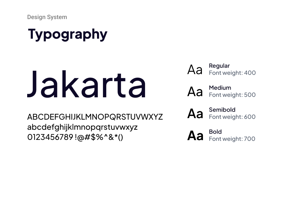
Font: We chose Plus Jakarta Sans for its clean and modern appearance, which enhances readability and helps users quickly absorb information. Its variety of weights also supports a clear visual hierarchy throughout the dashboard.

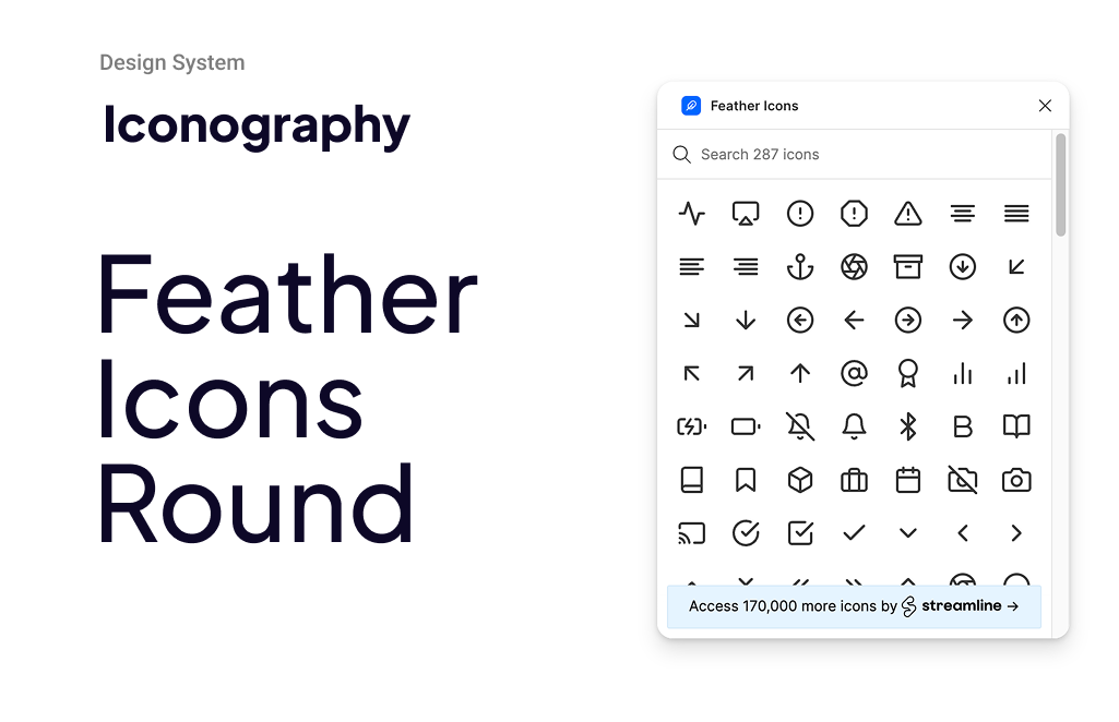
Icons: Feather Icons are lightweight and minimalistic, fitting the dashboard’s clean design perfectly. Their consistent stroke style complements the typography without overwhelming the interface, and they scale well on different screen sizes.

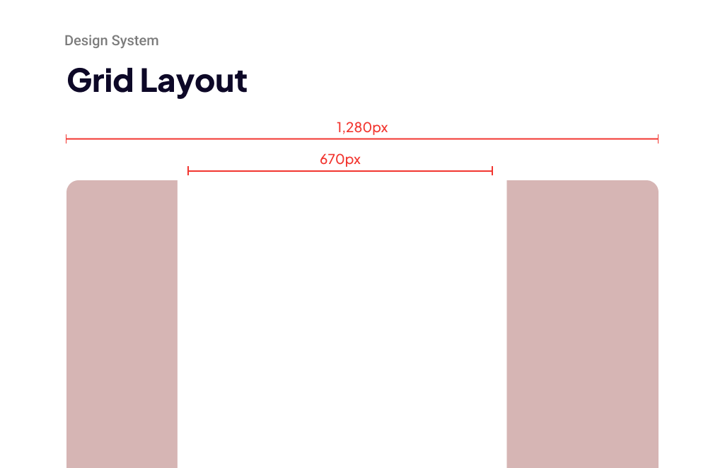
Layout Grid: Designed at 1,280px with a 670px container to maintain flexibility for smaller devices.

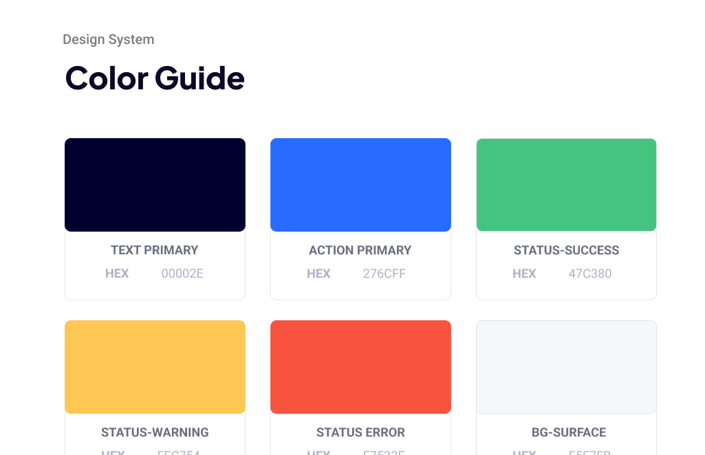
Colors: Following Jakob's Law, colors were kept consistent with regular common meaning. Ex: red for error, green for success, orange for warning..etc.

8.0 Closing

Achievements and Lessons

Results
•Agents felt clearer on where they stood daily.
•Small motivational touches increased check-in frequency.
•Managers found it easier to have constructive conversations with agents.
•A vague “encouragement” goal translated into a tool that balanced clarity and motivation.

Lessons
This project reminded me how small design choices can transform performance tracking from a stressful experience into one that feels clear, actionable, and even motivating. It was my first time to conduct that amount of user interviews and everytime I learned something new. A constant reminder of the importance of empathy in design.