


Trandy's allows users to easily create sandwiches from scratch. Customizing them in whatever way they please with an intuitive and seamless design.
Have a favorite sandwich but want to make it better? No worries. You can easily add or remove whatever you want easily from all of the sandwiches listed.
Checkout process is adjusted to be in the fastest and easiest way.


I conducted interviews and created empathy maps to understand the users I’m designing for and their needs. A primary user group identified through research was working parents who don’t have time to cook healthy meals for themselves or their kids. This user group confirmed initial assumptions about Trandy’s customers, but research also revealed that time was not the only factor limiting users from cooking at home. Other user problems included obligations, interests, or challenges that make it difficult to get groceries for cooking or go to restaurants in-person.

Ismail is a University student from Syria who needs An online ordering app that would help him get his food easily because he finds it hard to communicate with staff due to his English level.
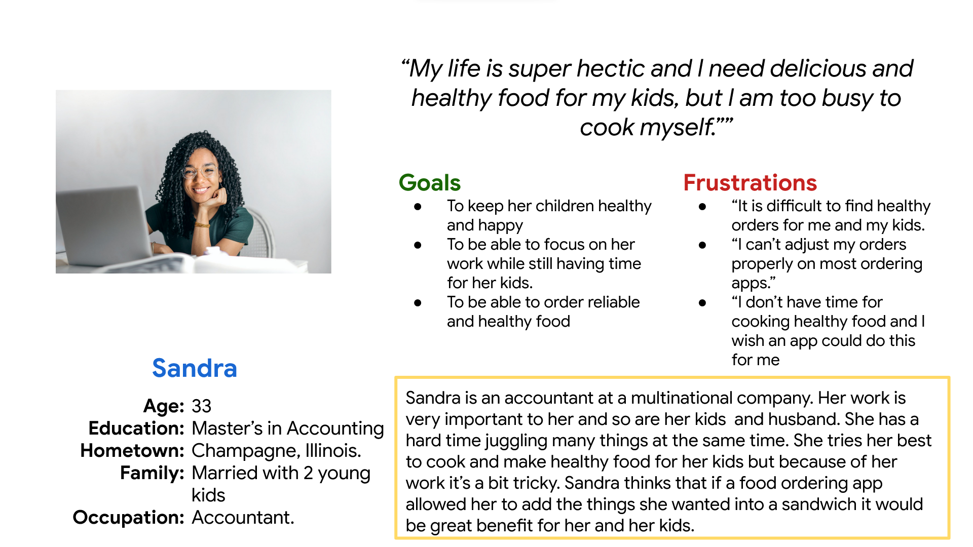
Sandra is a Married working mother with 2 young kids who wants to be able to order healthy food for her family because she would rather spend the limited time with them.
Mapping Sandra’’s user journey showed how important it would be to create an app that allows users to create custom sandwiches with healthy ingredients.
Mapping Ismail’s user journey showed how important it is for users to have access to an app that would be easy to use without much text.


After ideating and drafting some paper wireframes, I created the initial designs for the Empath app. These designs focused on making sure that the application was easy to navigate and to show the daily updates.

As the initial design phase continued, I made sure to base screen designs on feedback and findings from the user research.

It was a top priority to make the process of creating a sandwich as straightforward as possible and to facilitate the navigation of the app as a whole.
Using the completed set of digital wireframes, I created a low-fidelity prototype. The primary user flow I connected was building and ordering a sandwich, so the prototype could be used in a usability study.
View the Trandy’slow-fidelity prototype

I conducted two rounds of usability studies. Findings from the first study helped guide the designs from wireframes to mockups. The second study used a high-fidelity prototype and revealed what aspects of the mockups needed refining.


Early designs didn't visually include the ingredients that had been added to the customized sandwiches. Usability testing showed that users kept going back and forth to add more items to the sandwich. After the usability study we included visuals and kept it all on one page for better user experience.e

The second usability study revealed some frustration that the checkout process was long so we added the address to the same page as choosing the payment method.


The final high-fidelity prototype presented a clearer user flow for building your own sandwich or ordering in general. It also met the users needs for order tracking as well as more customization.
View High-fi prototype


The app makes the users feel like Trandy’s really focuses on meeting its customers need and puts them front and center.
One quote from peer feedback:“The app is so easy and sometimes even fun to make a customized sandwich. It could definitely be a go-to for delicious and healthy meals for me and my family”
While designing the Trandy’s app, I learned that the first ideas for the app are only the beginning of the process. Usability studies and peer feedback influenced each iteration of the app’s designs.
